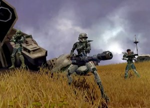
 The folks over at GameTrailers have an exclusive SWTOR developer diary that provides 6-minutes of insight on combat. During that time it shows some of the most detailed combat footage seen to date, covering most of the classes. If you want a really detailed dissection, you might like to check this out.
The reaction to date has been mixed – I tend to think the light saber dueling is a little rushed looking, but I imagine there’s still plenty of work still going on in regards to movement so that it looks better by release date.
One key thing that stands out for me after watching the piece a few times is just how well developed SWTOR is graphically. Sure, there’s not much given away about the user interface or most of the game mechanics, but it’s really starting to look pretty – that does count to some extent.
Anyway, have a look at the video:
Over to you: do you like what you see and does the combat shown make particular classess appeal to you less or more as a result?


Was impressed with the Jedi
Looked alrite in some areas, but others still need a touch up.
I like the way they hinted at the combat, but tried to give the best way to show it with out making it look too staged.
Its good to see what has been talked and read about actually in action, the characters looked like they were from star wars.
The Jedi cloak/armour combo looked smooth and impressive, while the appearance of the Sith characters looked dark and powerful, the lightsabers look a little “dark”
Humans still are horrible
And a final note, the combat looked like Star Wars, the attacks and abilities are what we associate with star wars, rather then the standard style of MMO attacks, the slash slash poke poke.
The combat animations add flavour far beyond what i have seen in other MMOs,
ZMG, BOUNTY HUNTER MADE ME PEE A LITTLE