Flash Point 39: The Stench of Desperation

A real mixed bag of a show this week. We talk a little on some adjustments to the show format, talk lots of SWTOR and a healthy slice of GW2, WoW and TSW at the end.

Points of discussion:
– Podcast feedback and slight change of format
Chevin world event
BioWare at Gamescom
Thousand Papercuts thread on the SWTOR forums
– Guild Wars 2 launch (and Aussie/NZ launch time conversions)
New content in The Secret World
WoW cinematic for Mists of Pandaria
– Shout outs for our forums, Facebook page and Twitter account

One minor technical note: we’ve had feedback on the naming convention of the podcast so we’ve changed the file names to be more descriptive for those not using a service like iTunes. Hope it helps a little bit!

Please review or rate the podcast on iTunes if you can – it makes a huge difference!

Listen via iTunes or right here:

Guild Wars 2 Facebook Group for Oceanic Players

Just a quick reminder for those Facebookers counting down the days until next weekend’s launch of GW2.

There’s a Facebook Group for Australian and New Zealand players right here – it’s a friendly group so jump
in!

And don’t forget that if you’re part of a GW2 guild and would like to be profiled, drop us a line!

The Secret World: Oceanic Gamer’s Review

Funcom’s The Secret World has been live for more than a month now. In the lead up to launch and immediately afterwards, I was hearing very polarised opinions about the latest MMO out in the marketplace. All MMOs are polarised, but this one seemed expecially so, with people saying it was terrible whilst others loving every second. My curiosity got the better of me so I paid for the digital download version and for the past two weeks have put in quite a number of hours each evening exploring.

Overall gameplay

Fun. That really does sum it up. I’ve never had an MMO like this where I’ve spent a lot of hours running around a fairly small geographic area (Kingsmouth) and enjoying at least 90% of it. I like the atmospherics, the pacing, the music / sound effects (quite minimalist overall) – in fact pretty much everything.

The reality is that you don’t ‘level-up’ in the same way as other MMOs, and is a big plus. Sure, you still get obsessed about achievement points (for more abilities) and skill points (for buffs to your abilities), but it’s a much more fluid process to gain those points and deciding what to do with them. Believe it or not, a lot of the skill side of things is actually fun to think about, which is something new for me in an MMO. With weapons, you get the chance to try them all out before choosing a skill / ability path to start down, and even then you can easily divert to other weapons if you want to.

Oh and Mac users: this is a Windows only game but it runs a treat on my three year old iMac in Boot Camp.

Quests

Like any MMO there are your usual ‘kill 12 of X things’ but I have to say that these were nowhere as frequent as any other MMOs I’ve played. Most of the quests are pretty interesting, particularly the invesitigation and surveillance missions, which require your thinkign skills, not your button mashing skills. There are of course daily quests and the like if you’re on a real XP grind. Oh – and there’s a web browser in-game to make it easier to do online research for some of the quests – a great feature.

Community

Like any MMO there’s the expected social features of group chat, private messages and general chat in each area. Having only got to the end of Kingsmouth I don’t feel qualified to discuss how social people are getting later in the game, but at this stage there’s not reams of toons hanging out in particular locations. One very subjective comment I’d make on general chat is that it’s a bit more civilised than other MMOs I’ve played although that could just be a result of the lower numbers on the server comparatively. That said, a warning: if you are thinking of jumping on general chat to have the brains trust answer the mystery you’re currently trying to solve, then make damn sure you’ve at least tried to research the answer for yourself.

Graphics and Music

This is where I became totally sold on TSW as a game I want to play longer term. I’m going to come out and say this is the best quality MMO I’ve played graphics-wise. Add to that the art style and the minimalist music, and it has me hooked. This is the only MMO I’ve ever played where I’ve always kept the sound on. Of course, graphics are a very individual thing so some may totally hate the style but I’m certainly not one of them. The rich colours (particularly in London as I rolled a Templar), are worth noting as well.

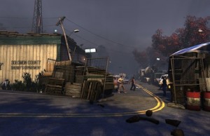
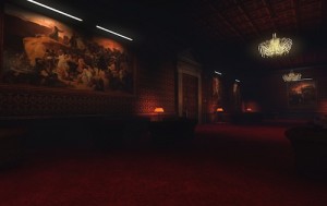
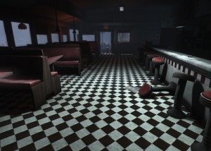
For those really interested in the graphics, I’ve created a slideshow of a dozen or so scenes from the game:

Story

I partly covered this in the quest section above, but I wanted to give some more emphasis to how engaging story can be in this game. Star Wars The Old Republic made much of the fact that it’s obsession is story, and they succeeded to a very large extent. I’m here to tell you though, that TSW kicks SWTOR’s butt in relation to story. Mainly because of how well the cut scenes are done, the natural language the NPCs use and the thought that’s gone into developing a story line that keeps you hooked. Both games appear to have done a good job in making people want to have multiple characters in the game.

The other key point to be made here are the stark differences between the Dragon, Illuminati and Templar. Sure, every MMO has its factions, but Funcom have done a great job in emphasising their differences, even though they’re all human. I’m hanging out to get more in-depth with the two other factions besides my Templar.

Items

Aside from the items you can pick up in the game, Funcom also have an item store where you can outfit your character to the style it deserves. You’ll need to buy Funcom points for the privelege – they start at US$5.00 for 600 points, and the gear you can buy ranges from 80 points up to more than 2000 points for the high end stuff.

The Downsides

I actually found it difficult to find significant negatives, but like any MMO they’re certainly there. The main frustrations / concerns for me were:

1. There’s definitely a lag issue at times. Not being interested in PVP, it never toally impacted my experience but there were times I cold see my cast bar lagging behind what I was pressing significantly – sometime to the point my cast bar was a whole action behind.

2. Some quests don’t work well if done out of order. There were a couple of times I’d realise I’d missed a quest involving a character I’d already dealt with and it didn’t complete for me properly. Some of that will be early teething problems too, and I know there’s been some fixes already with some quests.

3. I hate crafting – I just can’t get my head around the need to manually drag things into certain patterns. The approach does fit the wider design of the game but it just annoys the hell out of me. I may be in a minority there though and would appreciate your comments on crafting in the comments.

The Verdict

If you’re a lover of MMO that’s a little burnt out on the usual fare and looking for something different, then you should take a serious look at TSW. Even if you hate the whole monster / zombie schtick, this game is done well enough that you may still find it more than rewarding. If you want a simple hack and slash MMO then TSW may not be for you as you will need to think beyond key mashing and getting out of the fire.

Given the relatively small price of buying the game, which comes with 30 days free playtime, it’s not a big gamble. If you hate it or are indifferent to what it offers, then you’ve had a $60 experiment fail. If you love it, or can see it’s full potential developing in the medium term, then you keep subscribing.

The strongest point I can make on what I think about the game is what I did with my wallet: I bought a lifetime subscription.

Our score: 4.5/5 Greeblies

Now over to you: we’d love our thoughts on the game. Feel free to pick apart any claims we’ve made, point out any gaps or give us the low-down on later content in the game if you’ve got that far.

Full List of Guild Wars 2 Servers

AreneNet have released the details of the launch servers for GW2. You can see them in full below.

For oceanic players wondering what the unofficial Australian / New Zealand server is: at this stage it’s Sea of Sorrows in the US, but as with any of these unofficial arrangements it could change depending on server populations etc.

The full list:

US WorldsAnvil Rock

Borlis Pass

Yak’s Bend

Henge of Denravi

Maguuma

Sorrow’s Furnace

Gate of Madness

Jade Quarry

Fort Aspenwood

Ehmry Bay

Stormbluff Isle

Darkhaven

Sanctum of Rall

Crystal Desert

Isle of Janthir

Sea of Sorrows

Tarnished Coast

Northern Shiverpeaks

Blackgate

Ferguson’s Crossing

Dragonbrand

EU WorldsFissure of Woe

Desolation

Gandara

Blacktide

Ring of Fire

Underworld

Far Shiverpeaks

Whiteside Ridge

Ruins of Surmia

Seafarer’s Rest

Vabbi

Piken Square

Aurora Glade

Gunnar’s Hold

Jade Sea [FR]

Fort Ranik [FR]

Augury Rock [FR]

Vizunah Square [FR]

Kodash [DE]

Riverside [DE]

Elona Reach [DE]

Abaddon’s Mouth [DE]

Drakkar Lake [DE]

Baruch Bay [ES]


So which server will you be rolling on? Also – if you’re a GW2 guild that would like to be profiled, drop us a line

SWTOR at Gamescom: New Trailer

In case you hadn’t heard, BioWare have a presence at Gamescom in the US, and they’ve released a video showcasing some future content. Have a look for yourself:

For avid SWTOR followers there’s nothing hugely new in there although I think there’s some shots I haven’t seen before of Makeb and Terror from Beyond.

Over to you: anything in particular that gets your juices flowing from the whole 1 minute of preview?

Oceanic Soap Box: A Month Of Launches

Anyone remotely following the MMO market at the moment knows that the coming month is a huge one. With Guild Wars 2 launching, the pre-Mists of Pandaria patch hitting World of Warcraft and both SWTOR and The Secret World getting content updates, there’s more on offer than hours in the day for most of us.

This is where you come in: are you getting involved in GW2? Are you pumped for new WoW content? Knee deep in the new SWTOR world event? Or are you playing something totally different that you want to tell people about?

Jump on the soapbox and let us know!

Mists of Pandaria Cinematic Trailer Released

It’s been a while coming, but Blizzard have release the cinematic trailer for next month’s Mists of Pandaria expansion.

Enjoy!

Over to you: what are your thoughts? Is the cinematic more or less than you expected?

SWTOR’s Thousand Paper Cuts

Sometimes it’s easy to slag the official forums of any MMO, and the SWTOR forums cop their fair share of criticism. That’s why it’s always great when someone does something really constructive.

SWTOR Forumite cyrus_krell has created a thread called ‘A Thousand Papercuts’, based on a similar thread created quite a while ago on the EVE Online forums. It’s purpose is to be a repository of little annoyances (papercuts) in the game, which could probably be fixed without a huge amount of resources.

Creating the thread is of course the easy part, but cyrus_krell has very much led from the front by posting a massive list of papercuts- we’ve printed the list in full below for those of you at work that can’t access the forums.

So do read on below, do contribute to the thread, and definitely do what you can to agitate for these small but annoying papercuts to be healed. Imagine how much better SWTOR would be if even a percentage of these were removed. And major kudos to you, cyrus_krell!

The original post:


In late 2010, there was a thread created on the EVE Online forums with the same title. The players organized to civilly and thoughtfully outline their issues with the game, sticking almost exclusively to small, quality of life issues, or very simplistic suggestions to improve their gameplay experience. Game developers at CCP, the makers of EVE, quickly took notice of the thread and kept their eye on it for a while, eventually organizing a small team within the company to get together in their spare time to look into “the small things.” Their efforts were rolled into the summer 2011 expansion, Incarna.

After EVE’s Noble Exchange debacle in the summer of 2011, in which there was a sudden focus on exorbitantly overpriced vanity items that sent the community in an uproar, CCP was forced to call an emergency meeting of the CSM (a player-elected group of representatives that meet with developers in Iceland biannually to discuss and address the concerns of player constituents) and plot a new direction for development.

After many meetings, public apologies, and internal restructuring, CCP pivoted towards seriously addressing the concerns of players. The Thousand Papercuts Project quickly turned from an erstwhile hope into a very prominent development plan, and the small team working in their spare time became an officially recognized group with the resources necessary to bring that plan to fruition. The Crucible expansion, released in the winter of 2011, was the realization of all their efforts, and focused mainly on the Thousand Papercuts idea, as well a large contingent of bug fixes, balancing, and other quality of life stuff.

Crucible was welcomed by the community with open arms, and CCP made it a point to emphasize that the spirit of the expansion, the Thousand Papercuts idea, would remain a significant part of every subsequent release that followed. Indeed, CCP kept good on their word, and in the expansion that followed (and the one currently in development for winter 2012), a significant portion of the content released has included a focus on “the little things.”

As an aside, it should be noted that CCP is very close with their community of players and fans, and there is much that Bioware can learn from their example–both from their successes and from their failures (like the NeX incident).

I’d also like to point out that I have been playing EVE Online since early 2005, and I enjoy it and SWTOR very much.

Overview

With this thread I aim to gather the papercuts–the little things that don’t necessarily break gameplay, but add up to lessen our experience with the game as a whole–and list them in detail, along with some possible solutions to increase the quality of life for all players. The focus will primarily be on small things (annoyances, quirks, and the like), but I’d also like to include a couple of larger feature requests just to round things out.

The goal is to get the community organized and put all of the feasible, well thought-out ideas into a single thread. To keep things as focused as possible, the intervention of moderators and community leaders may become necessary to keep things tidy.

I’d ask anyone who wants to contribute to the thread to limit their suggestions to the small, quality of life stuff (examples will be outlined below), and to also limit discussion in the thread to coming up with and working out creative solutions that others may not have considered. Don’t judge or criticize anyone’s post, instead try to be constructive and offer solutions or feedback. Repeating complaints or ideas outright also isn’t helpful, but do feel free to offer a unique solution that has not yet been presented on a certain issue. Brainstorm!

Please, don’t post unless you want to contribute to the discussion; remain on topic and, above all, be civil.

Contributing

Try to focus on small things, i.e. things that seem too insignificant to file bug reports, or things that most people don’t openly view as an inconvenience; the things that you get used to after a while and find workarounds for, or simply put up with, but they still bother you to some degree; the little things that–by themselves–don’t account for much, but all of them in concert cause frustration or decrease the quality of your gameplay experience.

Some examples:

  • Mailing currency between characters on my account, despite the fact that they’re connected through the Legacy system, is cumbersome and annoying.
  • What do I do with all of my planetary commendations now that I’m level 50? I have no real use for them besides buying armor mods and selling them on the GTN.
  • When on my speeder, or running with my saber drawn, I can see the back of my Inquisitor’s head clipping through the mesh for the hood of my chest piece.
  • The sounds used by vibroswords are nearly identical to that used by lightsabers. This makes no sense given prior context (KOTOR).
  • Font options in the UI would be nice. I can barely read the chat window unless I’m in a dark area. Hoth is hard enough on one’s eyes, but reading chat text while playing there is a nightmare.
  • The /r reply system for whispers is annoying and sometimes broken. In some instances, it will display one character’s name, but will reply to another if you have had more than one recent private conversation.
  • It’s also hard to differentiate at a glance whom it is that’s whispering you because all the names are the same color.

Try to keep your posts clean and well organized. The use of bullets and indentations will help immensely to that end. The easier they are to read and comprehend, the more likely it will get a community manager’s attention, and just maybe they’ll forward the thread to a developer.

The Little Things

Here are some of my own “papercuts.” Feel free to expound upon and contribute to them if you have ideas or solutions other than the ones I’ve presented.

Appearance / Art

Inquisitor head mesh clips through hood mesh under certain circumstances.

When on my speeder or running with my saber drawn, I can see the back of my Sith Pureblood Inquisitor’s head clipping through the mesh for the hood of my chest piece. I do not have this issue on my Miralukan Jedi Knight.

I don’t really know of a solution, other than perhaps someone in the art department looking at the issue and changing how hoods hang on player meshes. I know that the hood up/down feature is being looked into and worked on (it’s on the backburner, I think (?)), so perhaps this issue is also being addressed therein. Also, I personally know of someone who has already submitted this issue in a bug report.

Inquisitor and Consular hoods don’t stay up with any non-circlet style headgear.

The hood of the chest armor on my Inquisitor disappears when wearing helmets like [Kallig’s Countenance], as well as in the preview window. However, I have noticed that some helmets do actually work with hoods, like the [Santhe Corps Light Exoskeletal Headgear] or the [Force Sentinel Headgear] (which looks really cool), but they only seem available to wearers of medium armor.

A solution seems pretty simple, but if there’s anyone with direct knowledge of how the underlying mechanics work (like a developer), please feel free to correct me if I’m mistaken. My guess is that it’s simply a flag that’s set in whatever database entry that exists for the medium armor pieces in question.

Many styles of armor, especially level 50+ pieces, are too elaborate or unrealistic for the purposes of combat. Some seem difficult to move around in while wearing.

Again, this is another matter of personal taste and an issue with art direction. While not as gaudy or garish as the much derided clown suits in the World of Warcraft, it’s something that annoys me, and perhaps creates a semi-conscious link to the WoW aesthetic that leads many players to place SWTOR in the same (tired) concept box.

Star Wars has a particular look associated with it–one that is simple, if not practical, and without too much flash or gimcrackery. Simplicity is a good thing! I like the simple-yet-elegant design of the [Saber Marshal’s Robe], for example.

As an Inquisitor (or Consular), I am tired of wearing robes and dresses!

This is just a personal preference, honestly, but I would love to see more variety in the options availed light armor wearers. More access to pants and matching tops would be wonderful. Let’s face it, the Formal and Ulgo Noble social/adaptive armor sets are gaudy, and are essentially two of a small handful of style options.

Limiting armor pieces and styles to certain classes or factions often seems pointless and can be limiting to the point of frustration.

It’s just frustrating to find that, even though the armor class requirements are met, I can’t dress a particular character in a style befitting the character or my personal desire for its appearance. Worse still is that–especially in the case of custom (orange) armor pieces–it limits my options for gearing my companions. Finding a really cool-looking medium armor piece that would help keep Mako up to date with my Bounty Hunter is pointless if it’s restricted to Imperial Agents or Marauders. True also is the frustration with which I’m met when–in the case of perhaps wanting to roleplay a fallen Jedi, or a neutral Sith, or maybe a former Republic Trooper-turned-Bounty Hunter–I’m limited to whatever so-called ‘neutral’ armor looks like depending on which faction I’m playing, or that I can’t have a Dark Side Consular wearing a [Dark Acolyte’s Robe].

Removing class and faction requirements could be an excellent start, although with the latter I would think it necessary to allow the appearance of certain armor styles of various factions to appear the same for an opposing faction (i.e. a class-agnostic [Guardian’s Exalted Body Armor] looks the same for Empire characters as it already does for Republic characters). Perhaps I picked it up off a Jedi I just ran through; why let his armor go to waste now that I’ve killed him when I could use it as a disguise, or simply wear it as a trophy or a display of my dominance? Or maybe it just looks bleeding cool and I want to wear it, consarnit!

Even though it’s been 300 years, I’m sure there have to be some Sith Trooper armor pieces from KOTOR floating around the galaxy.

Sith Trooper armor (image link) is not to be confused with the Imperial Trooper armor set. I’d love to see this in the game, especially the chrome set–I wore it for quite a long time in KOTOR. It just looks so boss!

Perhaps it could be included as adaptive/social gear, or an armor style (see “Lofty Ideas” below). Considering its age and (perceived) rarity, maybe one might purchase it from the upcoming cash store when the game goes free-to-play in winter 2012. For a reasonable fee, of course (please, Bioware, learn from EVE Online’s NeX folly).

Some lightsaber handle models look awfully brittle or unwieldy, and not very practical.

This is simply a matter of personal taste and an art style issue. The one thing I really love about the Star Wars universe is that, even at its most fantastical, things operate with a certain sense of practicality and realism within the context of the setting.

Lightsaber beam meshes can disappear when viewed head-on (i.e. from the top down).

I realize this is a limitation of the lightsaber mesh itself, and the part for the beam is constructed of intersecting polygons with a (seemingly) animated (probably through script) texture that features an alpha channel. I seem to recall the shader used in KOTOR for the lightsabers not behaving in this fashion (correct me if I’m wrong), and would like to see an improvement in their appearance if possible, including the light that is cast from the saber (which sometimes appears on walls in a weird fashion, looking like a cone spotlight from a flashlight with a dark center for some reason).

The textures of planets in the ship approach cutscenes are blurry, no matter how high graphics settings are set.

Obviously, it’s a texture resolution problem. The texture size is fine for the smaller planetary view, like when viewing the data before making a jump to the location. But when viewed up close during the approach of your ship, it looks atrocious; as though it belongs in a game from the early oughts, rather than 2012. Nar Shaddaa is perhaps the most glaring example of this.

Legacy

A Legacy Wallet would be awesome and of immense help.

My brief time with the Diablo 3 beta introduced me to the concepts of shared currency between all characters on my account, and also a centralized place to store items all my characters could access. Say what you will about the shallowness of a game like Diablo (which is sometimes fun to just veg out and play, don’t get me wrong), but these are brilliant ideas that I’m surprised haven’t made it into MMOs yet.

Shared currency between the characters seems pretty straightforward, so I shan’t expound upon that too much.

A legacy bank tab would operate much in the same way as the current mechanics for ship cargo holds and guild banks, especially the latter due to how the item binding system works currently. Obviously, it would only be able to hold unbound and Legacy-bound items. The most practical method of acquisition would be to connect it with a legacy unlock; Legacy 1 and a reasonable amount of credits for the first tab for example.

This is the only Legacy idea that I have off the top of my head. I’m really interested in hearing more ideas from other players because I feel that the Legacy concept has a lot of untapped potential.

UI

Sending my companion out to sell all my grey junk is fine and well, but clicking through every single item at a vendor is tedious at best.

I’m sure you’ve all been there: You’ve just finished about an hour of grinding or running heroics with a friend, but have forgotten to send Khem Val off to sell your junk, and you’ve just come to a vendor. Only being able to click one thing at a time is, indeed, monotonous and annoying.

There could be a couple different solutions to this dilemma. One way would be to allow the selection of multiple items before selling, but existing hot keys might have to be changed (CTRL+Click previews an item and Shift+Click links an item in chat). Another option is a Sell All Junk type button in the item or vendor windows.

It’s not easy to determine the level of a given item’s augment slot.

The item modification window does not show what level an augment slot is unless the slot is empty. Since augment slots are backwards compatible with augments from lower levels, guessing what level the slot is can be difficult without removing the augment. Aside from the annoyance at the cost involved in doing this, it is just poor design.

Game text is sometimes illegible.

I can barely read the chat window unless I’m in a dark area. Hoth is hard enough on one’s eyes, but reading chat text while playing there is a nightmare. Text colors can be changed, and the ability to change text colors is limited solely to chat text, but legibility in changing environments is difficult at best without sacrificing valuable screen real estate. Furthermore, whatever smoothing/scaling algorithm is being used can sometimes make all text on the screen quite blurry, though that could depend on certain display resolutions and aspect ratios (I operate at 1280×1024).

Expanding font color options elsewhere would be helpful, as would having more options for varying the size and typeface used for various independent UI elements. Tweaks to the smoothing/scaling algorithm to improve legibility could also be beneficial.

The /r reply system for whispers is annoying, confusing, and sometimes broken.

In some instances, the text entry bar will display one character’s name–presumably the last person to whom you’ve replied–but will reply to another if you have had more than one recent private conversation.

Character chat tabs could be a solution, though I have long enjoyed EVE Online’s implementation of chat windows. Coming from windowed IRC (and later IM) clients where each person had a dedicated window, it just feels intuitive to me.

And on that thread, chat logging would be nice–for private conversations, certainly, and also to assist in code of conduct/end-user violations cases for any player or GM that’s monitoring general chat.

It’s hard to differentiate at a glance whom it is that’s whispering you because all the names are the same color.

Let’s be honest, all the text in that chat window is smashed together pretty tightly, and it’s pretty hard to distinguish any one person without giving it your full attention. And even then, the text can sort of…run together after a while. Changing text colors for various chat messages only changes the color for the message type and does little to address legibility and the discernment between other players.

A possible solution would be to alternate the shade of a particular color every other line. Highlighting messages that you send out to differentiate them from the chaff, as well as those messages which mention your name, would also be good. The adjustment of line spacing, indentation, character name spacing–it’s all important for increasing legibility.

Economy

Mailing items and currency between characters in my legacy is cumbersome and annoying.

Shortly after 1.3 was released, the mail system buckled under heavy load, and there have been occasional glitches even before that. I can imagine that a very significant portion of mail traffic involves the transfer of items and currency between other characters within a player’s legacy.

The aforementioned Legacy Wallet solution should remedy everything quite nicely.

What do I do with all of my planetary commendations now that I’m level 50?

As our class storyline takes us through all the available planets, we acquire many planetary commendations along the way. And sometimes, even after we’ve hit 50, we like to go back and help some of our lower-leveled friends with heroics and other difficult content, for which we are rewarded with yet more commendations. By the time we’re in the end game, however, these forms of currency are essentially useless to us, unless we sell them on the GTN or use them to equip our other characters.

Allowing all the collected commendations to coalesce into the Legacy Wallet mentioned above would bring new purpose to commendations. And do consider the future: planetary commendations become useless while we’re focused on acquiring Black Hole or Rakata gear. As new content emerges and the level cap is raised, the commendations used to purchase end game armor will eventually fall to the wayside, too, but would be useful for other legacy characters.

Another potential use for outmoded commendations would be the option to redeem them for hard currency. This would be especially useful for those who have all their character slots filled with high level characters.

Loot

NPCs (Sith, Jedi, Troopers, etc.) should drop items associated with their appearance or class/faction.

In KOTOR, you were able to take the black clothes or robes off fallen Sith acolytes and wear them on your character or party members (you could use the aforementioned Sith Trooper armor, too). They also could drop lightsabers containing red and purple crystals that you could use or remove and place in the lightsaber you were using.

I’d like to be able to wear what that Jedi was wearing, or use that Marauder’s interesting looking lightsaber handle. Maybe, as a roleplayer, I like collecting trophies from my victories (and putting them in a rectangular wooden box…lol). In any case, it makes more sense for you to get from a particular NPC an item or items that are likely to be carried by that NPC.

Just as an example, the ships of a particular NPC pirate faction in EVE Online drop the modules, ammo, tags, etc. that’s associated with those groups as well as the ship’s class.

Addressing this would involve one of my aforementioned solutions (removing class/faction limitations on gear), as well as changing up loot tables and the distribution of loot amongst mob types.

Ambience

Vibroblades should not sound like lightsabers.

The sounds used by vibroswords are nearly identical to those used by lightsabers, despite the fact that, in KOTOR, vibroblades and Echani weaponry clearly use metal sounds, except when clashing with a lightsaber. It’s a distinctive characteristic that doesn’t make sense for the weapon and kind of breaks immersion. Vibroblade-type weapons should sound like a piece of metal cutting through the air, and should clang like metal when hitting armor or another metal weapon; they should not sound like lightsabers.

Miscellany

Why does the entire website, including the index page and forums, need to be unavailable during a patch deployment, server-side hotfix, or rolling server restart?

Indeed, this seems…a bit unusual, if not archaic. There’s not much sense for the basic face of the game–the main index page–to be unavailable at any time (save those rare 0.0005% moments). And for those players that are curious or chatty during downtime, there’s nothing for them to do as it relates to the official website; no patch notes to read, no forum in which to participate to pass the time.

Not everyone knows that there’s an official SWTOR Twitter account, and even that can be extremely vague at times. Worse still, the Tweets from the official twitter account will, during downtime, often link to things on the site that readers can’t get to because every page on swtor.com is unavailable.

Even when active in using the GTN terminal, I still go idle if that’s all I’m doing.

Changes were made to reset the idle timer for chat and engaging in crew skills, so that clicking around and searching the GTN still doesn’t count against your idle timer is a bit baffling.

Lofty Ideas

A more advanced and gear-independent character styling system.

As a casual player of DC Universe Online, I’m greatly impressed by their implementation of, and the depth of configuration for, character appearances. It’s amazingly straightforward and offers a degree of customization I haven’t seen since EVE Online’s character creator (while there aren’t yet many clothing options for EVE’s character creator, its facial and body customization options are absolutely peerless).

Armor, weapon, and skin styles are acquired through equipping gear pieces for the various character sheet slots. They are also bestowed by special one-use items whose sole purpose is unlocking a particular style for a given slot. The appearance style for that particular slot (chest, head, face, main hand, etc.) is then saved to a list. This list of styles is available as an appearance tab on the character sheet, and a given style can be selected for each slot independently of the gear actually used by the character.

Coloring of the character and the armor is handled interestingly, as well. When creating a character, players select the primary palette to be used by the character’s armor, consisting of 3 colors, as well as the colors and appearance of the character’s skin, hair, and eyes. Players can later change these colors after character creation. The combination of the 3 colors, and their order as used by the armor, are configurable for each armor slot, and can be altered in such a fashion that the armor can use all three colors or just one.

The implementation of such inspired features would go a long way to affording players the freedom to render their characters’ appearances precisely the way they want, and to do so without the headache and difficulty involved with hunting for new gear with precisely the kind of style they want, in the color that they want, every time they progress a few levels.

Crafters need not be left out of the opportunity for the monetization of gear styles. Synthweavers and Armormechs could have a single set of orange custom armor for each of the armor classes that has a very basic or unitarian style, and schematics would allow the learning of styles for crafting.

To facilitate the transition and to keep crafters from feeling snubbed for all the work and money spent previously in the acquisition of schematics, converting all the armor schematics they’ve already learned into said style-only schematics would be a good idea. This would also help to mitigate the frustration many players feel when the dreaded armor/gear hunt (that keeps their stats up to date as levels progress) clashes with their desire to have their characters appear as they envision.

Like DCUO’s own cash store, a handful of unique or whimsical armor styles could be purchased with Cartel Coins. It would add another incentive for free-to-play and subscription players alike to spend the currency they acquire through subscription rewards or direct purchases.

An NPC and player-driven contracts system; NPC and player bounties organized and issued through the Bounty Hunter’s Guild, and acquisition/delivery contracts issued through a black market system.

The lauded Bounty Hunter’s Guild from Star Wars fiction has the potential to add interesting gameplay options and storylines to the game. Weekly and/or monthly NPC bounties could be issued by Guild NPCs to players, and players could be able to issue bounties on other PVP-flagged players. This would add a very interesting dimension to PVP gameplay, as well as open the door to the galaxy-wide PVP some players (not myself, mind you) are clamoring for.

It seems unfair for this concept to be limited only to the Bounty Hunter class, but it does make sense within the context of the universe and, indeed, the storylines surrounding the Bounty Hunter’s Guild (read K.W. Jeter’s Bounty Hunter Wars trilogy, seriously). Smugglers need not be left out completely, however; the acquisition, transportation, and delivery of rare and volatile goods would give them a similar gameplay experience.

Regardless of either side, Bounty Hunter or Smuggler, players of other classes could join in for a piece of the action, partake in the risk, and split the rewards. This could add another layer, and a very interesting aspect, of cooperative play.

Where’s the API? Like spice, the data must flow.

A game API that’s accessible to independent developers of mobile and web apps, as well as PC applications, is achingly absent. I’m not much of an expert on API development, but in the case of EVE Online (and World of Warcraft way back in the day), it’s something I’m used to using to glean important information to utilize in making various aspects of gameplay less imperative or time consuming.

As an example, I’d like to cite the incompleteness of Torhead in comparison to the other ZAM Network sites and tools, like Wowhead. Determining drop rates and loot tables, or culling useful statistics from other game mechanics, is extremely difficult without access to more data. A site like Torhead or As Mr. Robot should be much more useful and contain much more information than is currently available.

Visually, the game looks a bit long in the tooth. The periodic implementation of graphical improvements would be welcome.

SWTOR has been in development a very long time (since 2005, according to an article I read, but haven’t been able to verify), and even with the updates and improvements to the Hero Engine, its age is beginning to show. Again, this is partly due to the length of the development cycle, but I understand that the limitations of the Hero Engine itself are also a factor. Another reason would be that the bulk of game development has been focused on story elements and gameplay mechanics (and from what I understand, updating the underlying mechanics of the Hero Engine).

Bear in mind that the focus on story and gameplay elements over keeping the graphics up to date is not to SWTOR’s detriment–I’d go so far as to say that it’s paramount over how the game looks. But now that the game is here and content development pipelines have been streamlined, it’s a good idea to address game visuals in the near future so as to keep the game fresh and to take advantage of the graphics hardware many of us have.

I’ve mentioned it a few times so far, but I must give credit where it is due: EVE Online is a distinctive representation of a game that refuses to stagnate or remain dated in the visual sense. Since its release in 2003, EVE has always looked visually striking through each iteration, and periodically improves upon that beauty–from the massive Trinity expansion to Incarna, and into the future. And somehow, in spite of the push to create new visuals that rival the old and take advantage of the newest and best in graphics hardware, it remains a game that is accessible to wide range of hardware.

Does SWTOR need to be as visually jaw-dropping as EVE? No. But sincerely, Bioware, don’t sit idle.

SWTOR: Server Downtime Tonight

We jinxed things on Monday saying that we’d maybe get through the week without a maintenance downtime. Given the issues with the world event some have had, I’m not surprised they’ve had to patch the game, which is what is happening for two hours this afternoon:

AEST: 5pm-7pm
AWST: 3pm-5pm
NZST: 7pm-9pm

At least it’s only two hours early in the evening. The full BioWare blurb:

We will be deploying a patch and performing an unscheduled maintenance this Thursday, August 16th, 2012. Patch notes will be made available shortly after the servers come back up.

The servers and SWTOR.com will be down for two hours on Thursday, August 16th, 2012 from 2AM CDT (12AM PDT/3AM EDT/8 AM BST/9AM CEST/5PM AEST) until 4AM CDT (2AM PDT/5AM EDT/10AM BST/11AM CEST/7PM AEST). All game servers will be offline during this period. This maintenance is expected to take no more than two hours, but could be extended.

After the maintenance, please login via the launcher to download the latest patch. If your launcher was open during the maintenance, you must close and reopen it for a fresh login.

Maintenance

Date: Thursday, August 16th, 2012

Time: 2AM CDT (12AM PDT/3AM EDT/8 AM BST/9AM CEST/5PM AEST) until 4AM CDT (2AM PDT/5AM EDT/10AM BST/11AM CEST/7PM AEST)

All game servers and SWTOR.com will be offline during this period. This game maintenance is expected to take no more than two hours.

The Secret World: More Details on New Content

Funcom have sent out the latest player newsletter, and it contains some interesting info on incoming content for the game.

For those that like packing a physical weapon, you’re likely to be excited about the addition of a rocket launcher to the arsenal. You’ll have to work hard to get it, but my guess is we’ll still see plenty of people running around with them. There’s also a bunch of new missions on the way this month as well.

For those at work who can’t access the official site, here’s the full break-down:

AUXILIARY WEAPON #1: THE ROCKET LAUNCHER!

Introducing a brand new weapon, featuring seven brand new abilities, wrapped in a brand new auxiliary wheel!


With the addition of a third weapon and eighth ability hot-bar slot, you can now augment your existing decks with the awesome might of the rocket launcher. The rocket launcher that goes ‘Boom!’.


More details will be revealed very soon — and this is just the first of many auxiliary weapons to come! We’re already working on the next one…and The Secret World should prepare for a real Texas-style massacre. Rrrrrreeeennnennennnennnnn!


THE MODERN PROMETHEUS!

Inside an abandoned abattoir in the bowels of Brooklyn, the infamous Dr Anton Aldini (Peter Stormare) has set up his paraplastic surgery — the Modern Prometheus — and on August 28th, his practice will be open for business.


With the Modern Prometheus, we’re introducing new heads and new facial features, allowing players to completely alter the way their characters look. The first visit is free, but subsequent nips and tucks will cost PAX. Coupons will also be made available in the item store for those players who are short on in-game cash.


OCKHAM’S RAZOR!

Unhappy with your hairstyle? With your beard or moustache? Your makeup? At Ockham’s Razor in London, you can change them all!


Doubling the number of available hairstyles, players can use in-game cash (PAX) or coupons purchased in the item store to alter their ‘do, facial hair or makeup.


NEW MISSIONS!

Mission Pack #2 — part of August’s issue — adds new investigation missions, the auxiliary weapon mission, and lair action missions to the game:


  • ‘Digging Deeper’ continues the story that began with The Kingsmouth Code, and sends players back to Pastor Henry Hawthorne at the Kingsmouth Congregational to dig deeper into the town’s secret history and Illuminati legacy
  • In ‘Death and Axes’, players learn more about Sophie’s close connection with the spirit world. In Transylvania’s Besieged Farmlands, the dead are restless, and Sophie is increasingly sensitive to their pain — causing Cern some concern for her well-being, and sending players on an investigation into the terrible events that have transpired here
  • ‘Strangers from a Strange Land’ introduces players to the ancient history of Solomon Island, going back to when the island was visited by Norsemen in their longboats, a thousand years ago. This investigation begins with Red (of Red’s Bait & Tackle) and introduces players to a pair of famous talking ravens from Norse mythology…
  • In Transylvania, Iele — the guardian of the Shadowy Forest — needs the player’s help in order to revive her ‘Singing Stones’ and fight the growing infection that threatens this delicate magical sanctuary
  • Acquiring the first auxiliary weapon — the rocket launcher — won’t be a cakewalk. In the first of a series of exciting auxiliary weapon missions, players will work with the Council of Venice to retrieve a highjacked shipment of rocket launchers. During the course of this mission, players face powerful new Orochi technology, travel to a brand new location, and come face to face with the two-faced Phoenicians


And these are just some of the missions that will be made available as part of Mission Pack #2!


NEW NIGHTMARE MODE DUNGEONS!

Two additional dungeons are receiving Nightmare modes in issue #2: The Facility and Hell Eternal.


Further testing the extreme limits of the players’ abilities, these new additions bring new challenges and new rewards to The Secret World.

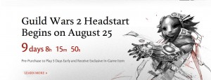
Guild Wars 2 Launch Details (With Australian and NZ Time Conversions)

ArenaNet have provided some further clarification of how launch of the game will work in just over nine days time. Read on below for the official details then for our local time conversions to make things a little easier for you!

Official blurb:

  • Pre-Purchase with 3-Day Headstart: Everyone who pre-purchased Guild Wars 2 will enjoy three full days of Headstart Access. The three-day Headstart Access will officially begin at 0:00 AM Pacific time (GMT -7:00) on August 25thHowever, please note that in order to ensure that we’re fully prepared for that fateful hour we may bring servers online up to 3 hours prior. If you’re a player committed to getting in first to grab that character name of your dreams you’ll want to be keeping an eye on things during that time period.
  • Pre-Order with 1-Day Headstart: Those who pre-ordered Guild Wars 2 will be able to participate in one day of Headstart Access. The one-day Headstart Access will begin at 0:00 AM Pacific time (GMT -7:00) on August 27thNOTE – Pre-Order code registration is now enabled.
  • For those players who have not pre-purchased or pre-ordered the game, Guild Wars 2 will officially launch at 0:00 AM Pacific time (GMT -7:00) on August 28th.
  • Download the Client today: If you’ve registered your pre-purchase or pre-order and created your Guild Wars account you can go to account management today and download the client. Be sure to update the client periodically to minimize your download at launch.

Now for the time conversions:

3-day headstart

AEST: 5pm on Saturday August 25th (and possibly a few hours earlier as per announcement above)

AWST: 3pm on Saturday August 25th (and possibly a few hours earlier as per announcement above)

NZST: 7pm on Saturday August 25th (and possibly a few hours earlier as per announcement above)

 1-day headstart

AEST: 5pm on Monday 27th August

AWST: 3pm on Monday 27th August

NZST 7pm on Monday 27th August

Official Launch:

AEST: 5pm on Tuesday 28th August

AWST: 3pm on Tuesday 28th August

NZST: 7pm on Tuesday 28th August

So overall it’s a pretty Oceanic-friendly launch window! We’ll be covering the launch as well as any happenings with unofficial oceanic servers etc. Also don’t forger we’re keen to profile GW2 guilds or local GW2 events and we’ll always have the latest patch notes and news. Also, if you’d like to write about GW2 for us, drop us a line!

Star Wars 1313: Second Trailer Released

Time for a second taste of the upcoming Star Wars 1313 (you can see the first teaser here):

There’s not a huge amount more than you see in the first trailer, but there’s enough to keep a lot of people panting until it’s actually released!

Over to you: is this a game that you’ll be buying?