Quick Start Guide: Maps and Navigation

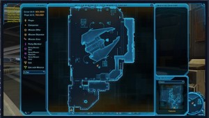
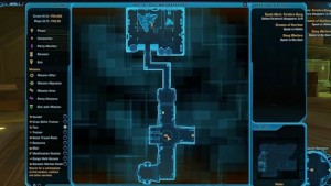
BioWare continue to trickle out their video Quick Start Guides, this time covering maps and navigation. These are very much aimed at new players, so don’t expect too many revelations. It covers the bases of current map functionality but it again highlighted for me the shortcomings of the current feature set – something we’ve covered before. I’m sure map improvements are on the development roadmap for SWTOR – there’s too many enhancements for there not to be work being done.

Watch the Quick Start Guide on maps for yourself here if you like – hopefully these guides will continue to expand and be a key part of the game’s initial learning curve.

A view from the ignoramus: the first 25 levels of SWTOR

Last night I hit Level 25 on my primary toon, a Jedi Sage. Although it’s just a number, it is the half-way point of my levelling (yes I know not time-wise but you know what I mean!). It got me to thinking about what I’ve found confusing or hard to understand over that time.

Even though I’ve lived and breathed SWTOR for the past couple of years, I’ve had a very purposeful approach when actually playing: I’ve taken the ‘ignoramus’ angle. What I mean by that is, I’ve not read up extensively on how other people play, nor have I read and tips guides etc. I’ve gone into the game to play it like any first timer would, albeit with an extensive WoW-playing history. It’s one of the reasons it’s taken me a lot longer than some to get to Level 25, with the others being that I’ve regularly stopping and admiring the scenery and I’m also listening to all dialogue.

So, it’s with this mindset that I’ve compiled a list of stuff that didn’t make sense to me initially. Hardcore players may laugh – that’s obviously your right, but this is for the more casual or newer SWTOR player with less MMO experience. And yes – I know there’s a codex, in-game help and the keyboard shortcuts guide if you bought a box copy – I ended up referring to these when I needed to. However, I don’t think I’m alone in wanting to mimise the time I spent reading text on how to play the game I should be playing.

And for the record: I can honestly say levelling up my Consular / Sage has been the most fun I’ve ever had in an MMO by far, so don’t see this as a negative attack on SWTOR more broadly.

With all that, onto my gripes:

Item modification

I’m not sure I’ll get a lot of agreement here but I find this as confusing as hell. You receive modification options dropped by enemies, others are provided as quest rewards and you can also buy them. So far that makes sense. It’s the actual process of making a modification that I found painful – right clicking on the modification just gives you the error message that the item can’t be equipped. I then realised you need to CTRL-right click on the item you want to modify, and select the mod from your inventory and drag it to the slot you want it in. It’s all a bit clunky really.

The other thing that continues to baffle me are modification stations. I’ve done zero homework on them, but they further muddy the modification waters and I’ve used them once I think.

Suggestions for improvement:
– right clicking on a modification opens your main window to start the process
– once this window is open, right clicking on the modification auto-installs it in the right slot

The Map

Overall I LOVE the SWTOR map that comes up when you press ‘M’ on your keyboard. It trashes the hell out of the WoW map. That said, I still find SWTOR a little confusing to get around. It took me at least a week after getting my ship at Level 18 to work out how to get back to it if I’d used my Fleet pass (each class has it’s own hangar where your ship is waiting, even if you didn’t use it to get there). I only realised by when I moused over a non-green Elevator icon on the Republic Fleet map. Also, working out where you are in the overall context of things is really only possible by using the Galaxy Map on your ship.

The other main gripe is the fact that you can only have one thing selected at any time on the map for viewing. I’m constantly switching between options, mostly between trainer, crew skills trainers and Quick Travel Points.

Suggestions for improvement:
– let me zoom out the map to see where I am in the wider scheme of things
– a portable galaxy map for those who get ships perhaps?
– a permanent Quick Travel option back to your ship
– allow multiple types of NPCs to be viewed on the map

Galactic Trade Market

This gripe is simple and related to the map issues described above. Finding a Galactic Trade Market kiosk isn’t obvious by any stretch of the imagination. In the first 25 levels I stumbled across a GTN once. If you switch on that view option in the map it’s easier but otherwise you really need to keep your eyes peeled. Sorry to mention WoW again, but the Auction Houses there stand out much better and tend to be the central feature of the large cities. Surely the only real option to engage in trade should be front and centre?

Suggestions for improvement:
– make the GTN more prominent
– allow GTN access from your ship

Run Like Hell

This one isn’t a huge gripe for me, but I know it is for a lot of other people. Because the worlds are so huge, I’ve seemed to spend a great deal of time walking and then running backwards and forwards. As a relatively experienced MMO player I was smart enough to understand the importance of picking up all the quests in an area and being as efficient as possible in handing them back in. Even so, I seemed to spend a lot of time running over the same territory. For me that was an opportunity to explore and I’m guessing that’s the intention. Once you have a vehicle it certainly get’s easier. The Quick Travel points are a godsend at times, although the 30-minute cool down prevents too much reliance on them for levelling.

Suggestions for improvement:
– allow vehicle access a little earlier than Level 25
– reduce cooldown on using Quick Travel points to 15 minutes

The Wrap-Up

After 25 levels of gameplay, I obviously have some whinges but none of them have stopped me enjoying the process a very great deal. Some harsher critics say SWTOR is half-baked – I couldn’t disagree more. For every time I’ve been frustrated by the issues above or even smaller stuff, there have been ten times I’ve been wowed by the look or feel of the game. That doesn’t mean things can’t improve and I have no doubt they will. Making those improvements will take a very good MMO to a potentially great one, and that can only make everyone happy.

Join The Gripe

Ok it’s your turn: what has annoyed you levelling and why? Post away in comments, it could make for an interesting discussion.

Flash Point 11: Boba Fett Was A Bad Guy

A fun-packed episode covering everything from the danger of firearms through to a discussion on adding a third amigo/amigoette to the Flash Point Team.

Points of discussion:

Bounty Hunter character progression
Maps in SWTOR
– San Diego Comic Con and potential announcements
Oceanic release update
– Oceanic servers
– Discussion on adding someone else to the podcast team
– Google Plus
– An ad hoc Skype video chat to determine what we each look like!
– Thanks to our iTunes Store podcast reviewers
– Shout outs for our forums, Facebook page, Oceanic Guild listing, and Twitter account.

Listen via iTunes or right here:

I’m the Map, I’m the Map!

Georg Zoeller posed a simple question to the design team: “Which part of the user interface is opened more than any other when playing Star Wars™: The Old Republic™?” It was a simple question, but the answer wasn’t any of the UI parts you might expect: not our character sheet, inventory or the Crew Skills window. No, the winner was the World Map. And it won easily – by more than an order of magnitude.

– Damion Schubert

This week Damion Schubert, Principal Lead System Designer for Star Wars: The Old Republic™ takes us through the tremendous task of building, functionality, and utility of maps for SWTOR. Maps are extremely important in any game, even more so in a MMO. Thousands of players on planets up to six times larger than any “Zone” on other MMO’s all trying to find their way across new and familiar worlds alike is a daunting task for a map maker.

The map process starts with a designer drawing a “Trigger Box”  that allows the designer to render only the objects inside the trigger box, then this basic map image goes through revision and enhancement several times to remove any objects that are misleading or were accidentally rendered that shouldn’t be there:

The end result is that we have maps that can show astonishing details about the game world. Chairs, crates, statues – all manner of items show up on the map from a birds-eye view, giving the player a real sense of where they are in the world.

– Schubert


Everyone hates searching for a quest objective for hours only to realize you’re in the wrong  section of the zone, and I personally don’t like a giant exclamation mark telling me the exact location – it kinda takes the point out of the quest. In SWTOR it looks like they’ve found a good balance by utilizing a semi-transparent circle around an area of the map that your quest objective can be found, so it still takes some searching but not aimless wandering.

The Breadcrumb system is another mechanism the designers at Bioware have added to make the traversing of massive planets a little less arduous. The Breadcrumb system works by showing the fastest routes to your active quest, which on most MMOs would be a nice add-on but on SWTOR it looks like this will be a extremely helpful tool. SWTOR has much larger “Zones” or “Worlds” than other MMOs, many with a lot of indoor complexes and entire planets that are cities. Schubert compares these to other MMO “Dungeons”, so navigating these could turn into a tedious task. The Breadcrumb system shows you which exits, tunnels, doors, and transit systems to take to get you into the action and back to your quest.

The last thing Schubert talks about is the ability to see your party members quests on your map and any shared quests (when hovered over with your mouse) shows all party mebers who currently have that quest. Combine this with the Breadcrumb system and the fact that your map goes partially transparent when your moving, makes it very easy to streamline chains of quests and side missions for grinding/static grouping.

May the Force be with you.